
A few days ago, the customer asked me if I could know the latency between the regions where Oracle offers service. This allowed me to create another blog about this feature available in the Network Command Center console.
The inter-region latency dashboard offers detailed visibility of real-time and historical round-trip latency for OCI regions, empowering users to plan their data center deployments in the regions that have the required level of latency for an application. This, in turn, can also make way for seamless application performance troubleshooting and cloud infrastructure optimization.
Historical latency data can offer the due monitoring and troubleshooting advantage, whereas OCI Metrics alarming can apprise users of the defined threshold exceed immediately over SMS and email notifications.
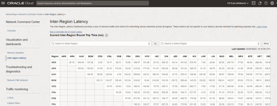
The Inter-Region Latency dashboard shows two charts:
- The Current Inter-Region Round-Trip Time is a current snapshot expressed in milliseconds. This snapshot is an average of values over the last five minutes. This view updates every minute.
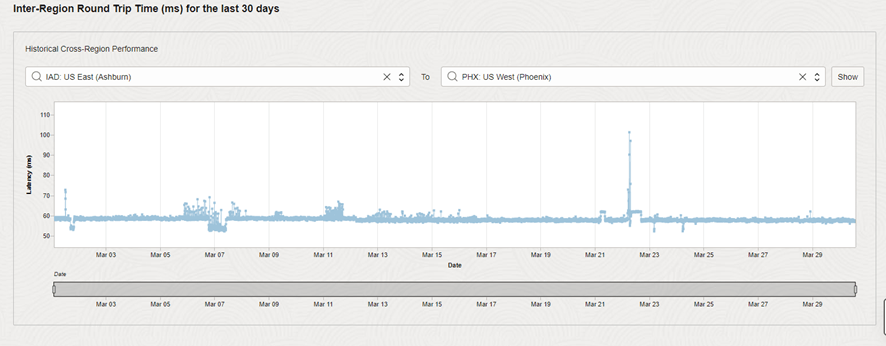
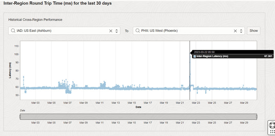
- The Inter-Region Round-Trip Time (ms) for the last 30 days is a historical view of the last 30 days
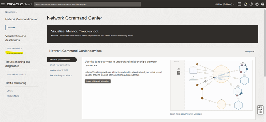
Using the Console
- Open the navigation menu, click Networking, and then click Inter-Region Latency, found in the Network Command Center group.
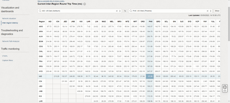
2. The Current Inter-Region Round-Trip Time chart is at the top of the page. With this chart you can:
- Select two regions (one is the “from” region and one is the “to” region ) and click Show. The relevant cell is highlighted and displays the RTT in milliseconds for the origin/destination pair.
- Hover over the three-letter code in the heading row or column to see the region name associated with the code.
- Click a cell in the table corresponding to a pair of regions to highlight the cell. The cell displays the RTT in milliseconds for the origin/destination pair.
3. Scroll to the bottom of the page to see the Inter-Region Round-Trip Time (ms) for the last 30 days chart. With this chart you can:
- Select two regions (one is the “from” region and one is the “to” region ) and click Show. The relevant graph of latency times between the origin/destination pair displays. The graph covers the last 30 days by default.
- Slide the beginning and end of the bar to change the time period covered by the chart using the date bar under the chart.
- Hover over a point on the graph to get the values in milliseconds for that point in time.
I hope this helps you!!!
Disclaimer: “The postings on this site are my own and don’t necessarily represent may actual employer positions, strategies or opinions. The information here was edited to be useful for general purpose, specific data and identifications was removed to allow reach generic audience and to be useful